UI improvements
Lets discuss CSS3 UI here.
This is my POV by the link:
And here is attached UI rearange example.
May be other users will share their insights, it would be really nice to improve CSS3 UI.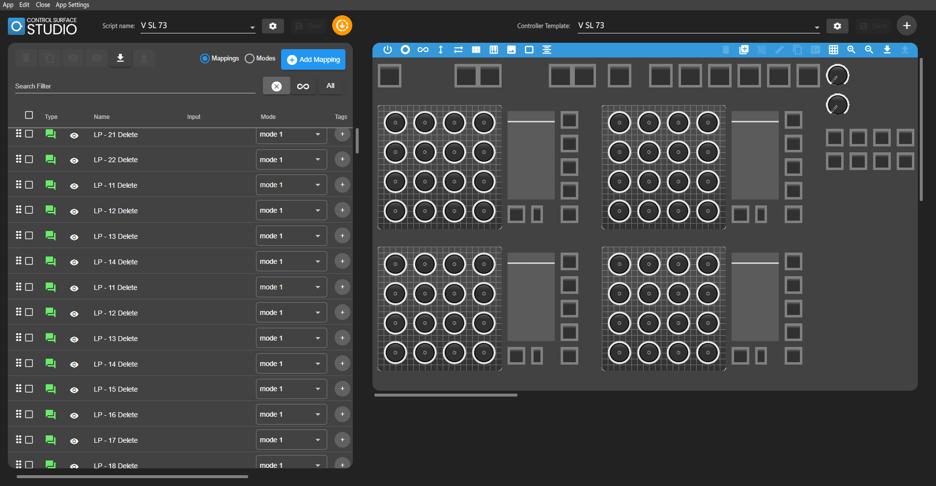
Hi Hellem,
Thank you for taking the time to make this, you made some very valid points here.
I like your idea of combining menus to save space at the top.
FYI the reason for the black colour on the left and white on the right is to visually differentiate between Ableton mappings and controller inputs. But I can see that this could be a little unsettling if sensitive to light/dark (i usually have everything in dark mode so do understand).
With regards to searching through your long list of mappings to find specific ones, why not just use the search filter at the top of the table?
This isn’t much help to you but the scroll bars you are seeing are only in the Windows version.
Sign up
User registration is currently not allowed.
Yes, filters are a good tool. The option to organise in Tree like in windows explorer folders – is a good tool also.